
CSA Latam · Web design
Turning a landing page into a clear digital presence.
A complete institutional website that gives CSA Latam a clear structure, sharper message and a scalable foundation for its work across the region.
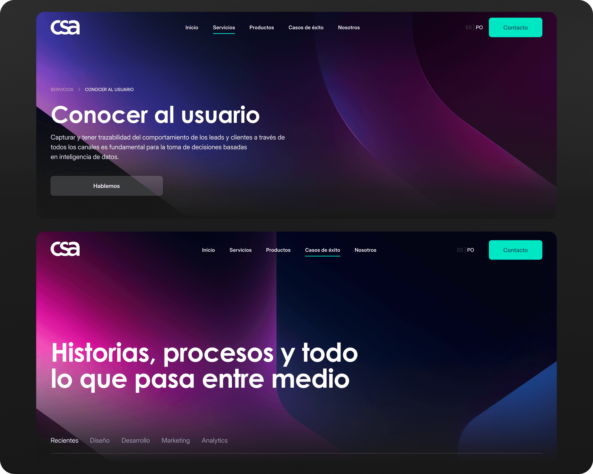
Making the offering understandable from the first visit.
CSA Latam had a very basic landing page: enough for an online presence, but not enough to explain who they are, what they do or how they work. The project transformed that starting point into a complete institutional website, built from the structure up.
Architecture before decoration.
The first challenge was not visual polish. There was no real site structure, the value proposition was unclear, and first-time visitors had no obvious path through the content. I mapped the essential sections, organised content around user intent and established a navigation model designed to grow with the business.
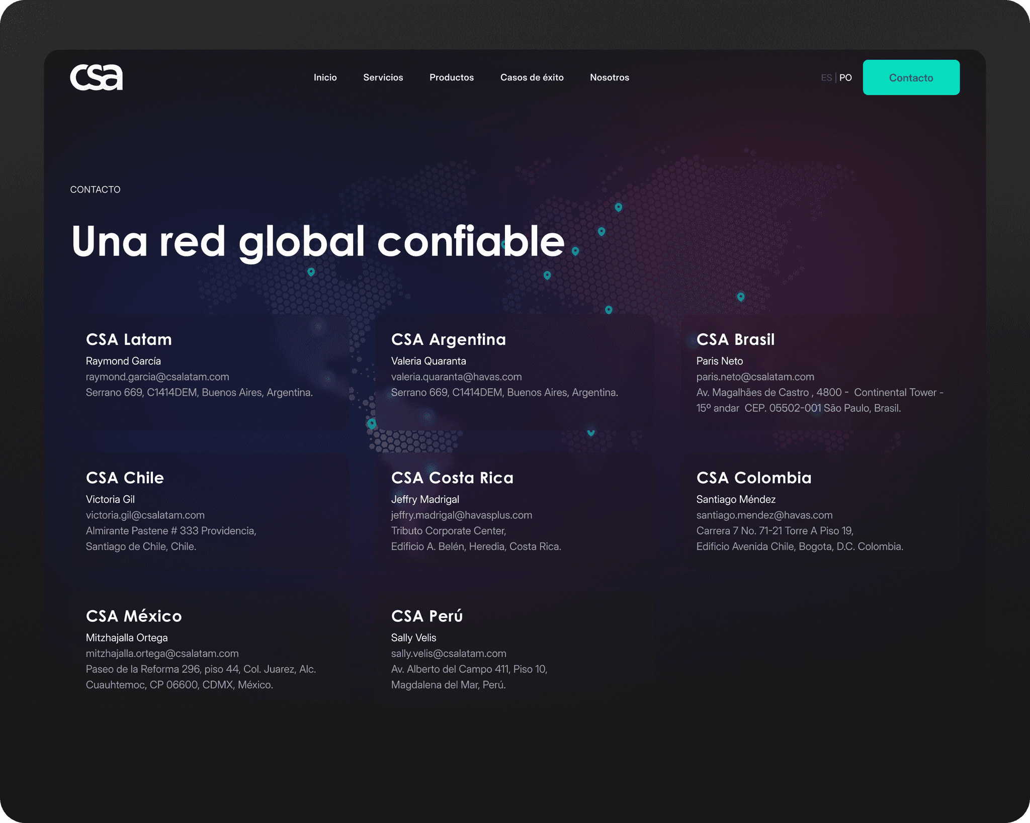
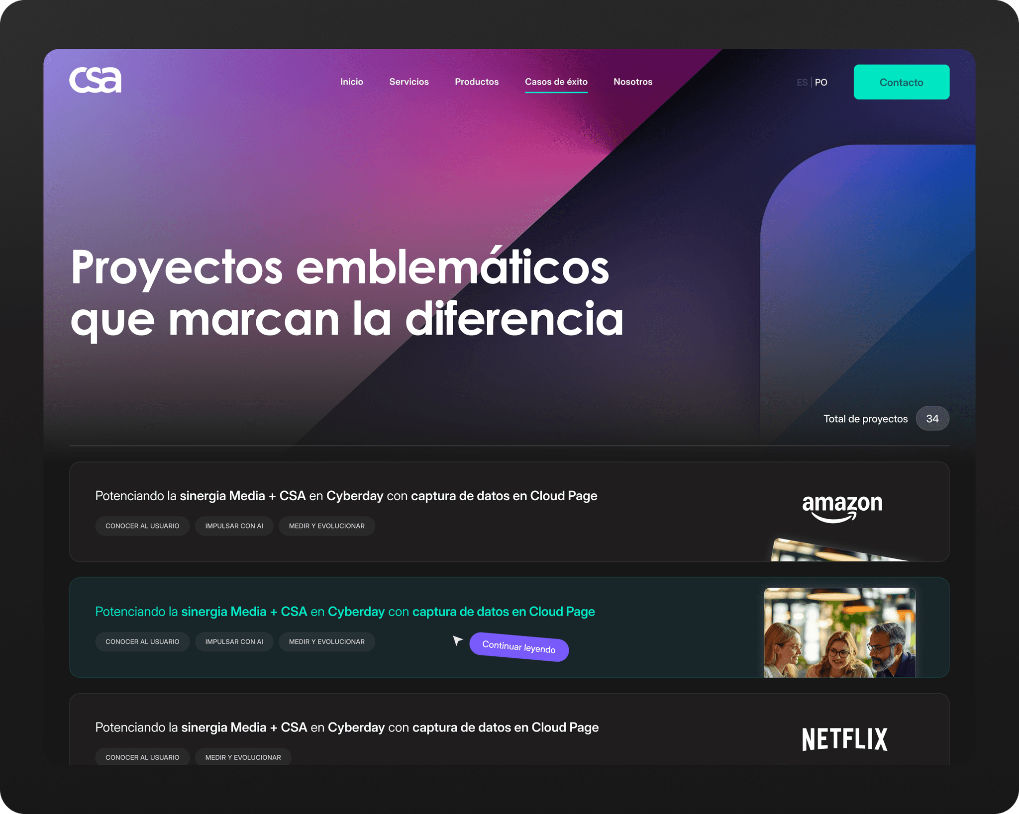
A visual system that supports the message.
Once the architecture was defined, I designed a clean, content-led interface with reusable components and a responsive system. The goal was to make the brand feel as considered digitally as it is in its work, without adding visual noise or overstating the story.
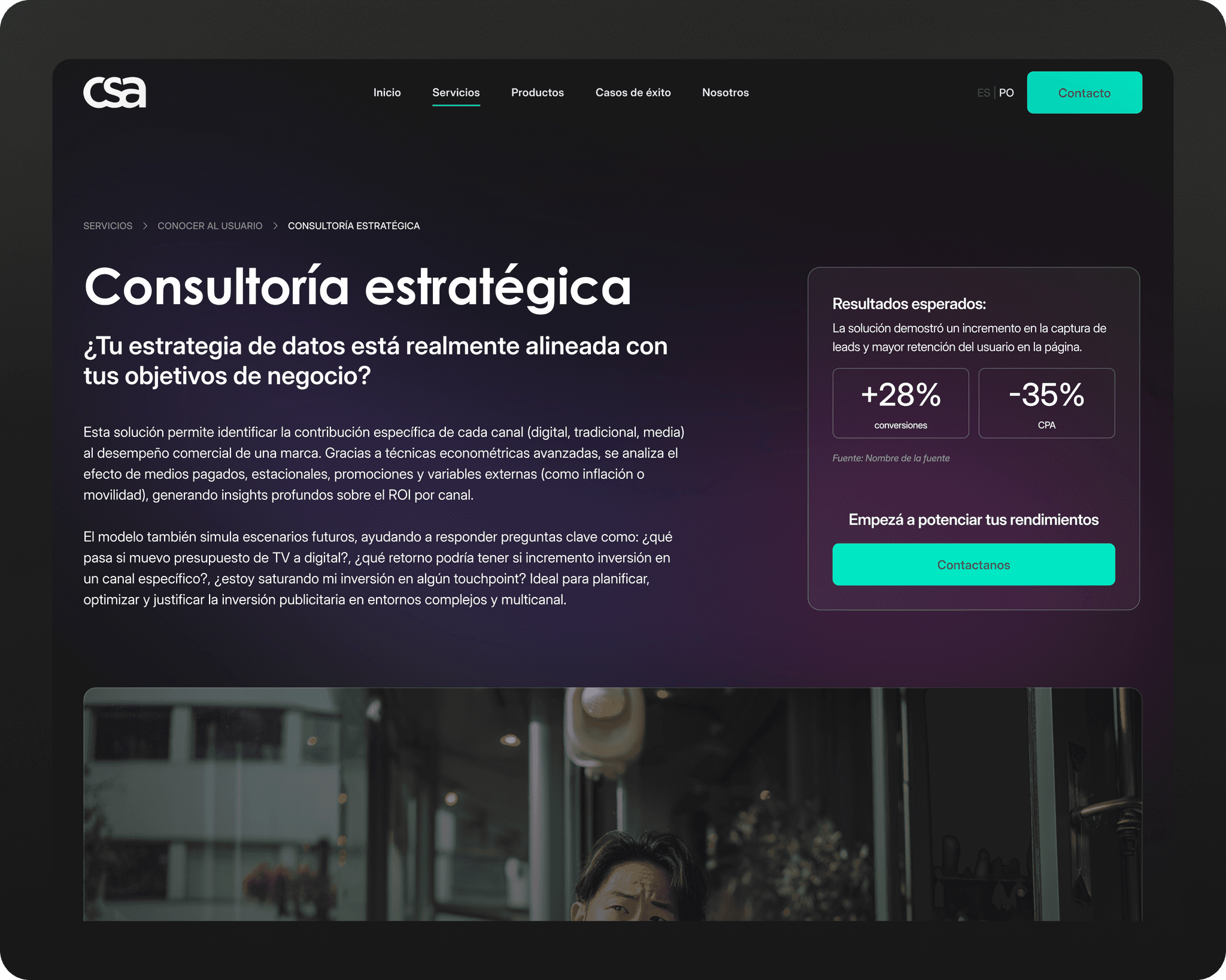
Outcome
CSA evolved from a minimal landing page into a complete institutional website with clear navigation, a stronger main message and a digital presence aligned with the brand’s professional level. It was designed to explain better today while providing a solid base for what comes next.
What I learned
This project strengthened my approach to information architecture and sharpened my UI practice. Defining the structure first made it possible to focus on visual clarity, consistency and detail rather than treating the interface as decoration.