
Residential Clearing · Web design
Designing trust before the first conversation.
A residential-services landing page built to make an early-stage brand feel clear, considered and reliable from its first touchpoint.
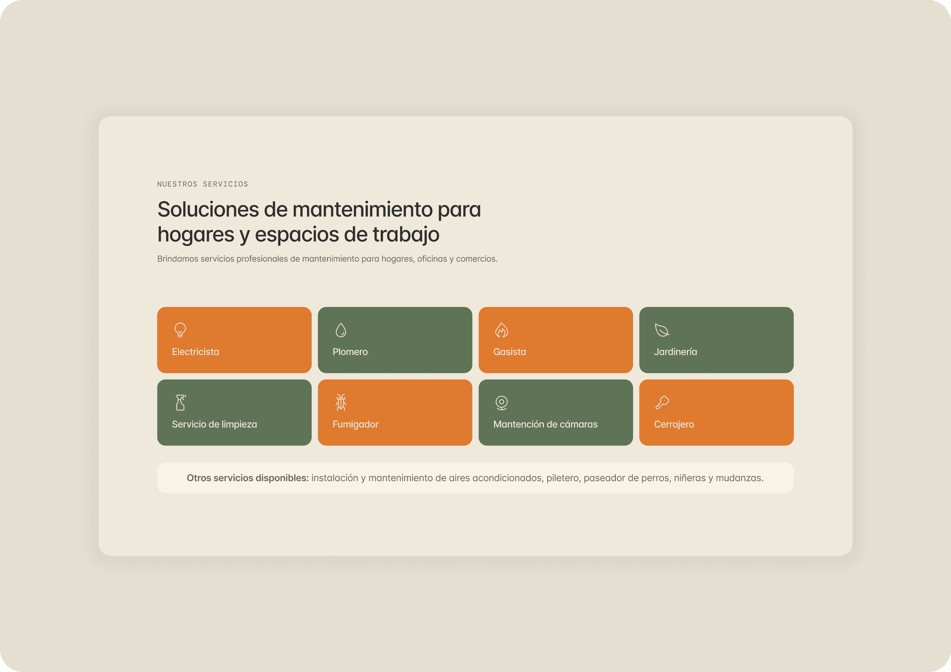
Trust is the product’s first interaction.
Residential services involve a high level of trust. People are not simply choosing a service; they are allowing someone into their home. The landing page needed to communicate a broad offering without becoming noisy, while making a new brand feel professional and approachable.
The project was designed as a validation tool: a focused first touchpoint that could create confidence before there were performance metrics, testimonials or a mature product ecosystem to lean on.
Making a broad offer feel clear.
The brand covers multiple residential needs. Giving every service the same visual weight would make the page harder to scan and reduce confidence. I used hierarchy to foreground core services, then acknowledged additional offerings in a quieter, contextual way.
The result lets visitors understand the scope quickly without asking them to process a dense catalogue at the first moment of contact.
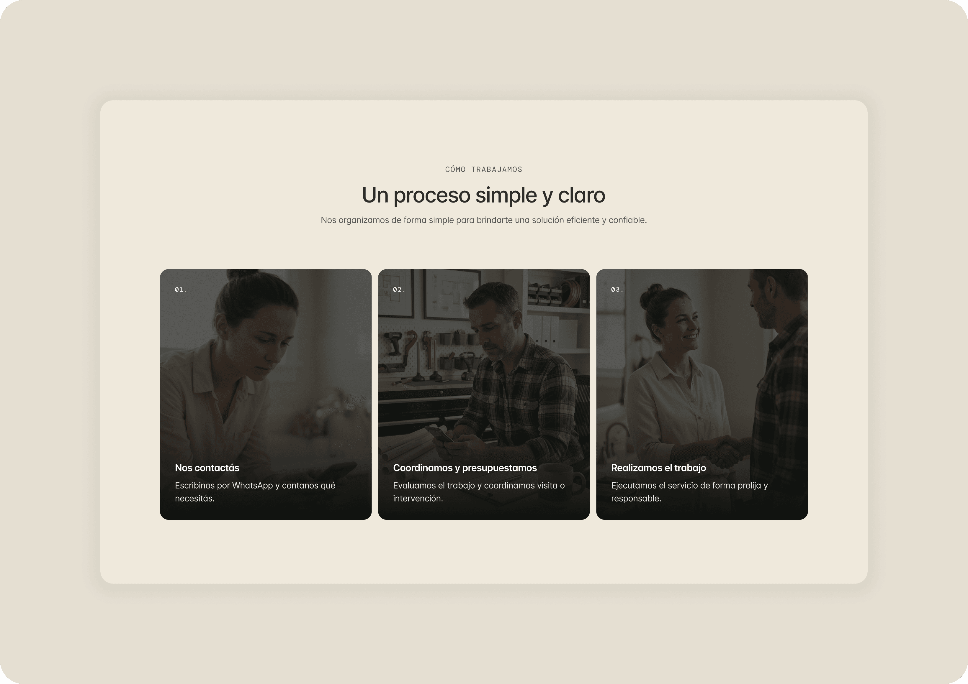
Designing for reassurance, not persuasion.
Without quantitative proof points, the visual system had to provide signals of trust on its own: calm layouts, measured spacing, clear hierarchy and a neutral, confident voice. Every choice was intended to reduce uncertainty rather than make exaggerated claims.
That same principle guided the service flow. Showing how the process works makes the experience feel transparent before a prospective customer has to ask.
Constraints clarified the priorities.
The page had a fixed service-grid component, specific services that had to be named, no research or interviews at this stage, and no metrics to surface. Rather than treating those constraints as blockers, they became a useful frame for deciding what needed the most emphasis: clarity, credibility and a structured path to contact.
Outcome
The final landing page gives Residential Clearing a focused, credible entry point and a foundation for future testing. It demonstrates that careful prioritisation and a clear hierarchy can communicate quality even before a brand has data, social proof or a larger product experience behind it.